Sunday 20 December 2009

BUBOLE

Have a spare few minutes? Why not go and create a monster on this link www.bubole.pl/#/en/create_new_bubol/.

Madeinhaus - Design firm

Just came across this design firm by accident, but their list of clients is very impressive. They've done some major work for some of the most iconic brands  such as; Microsoft, Armini, Coca Cola, Nike etc.

Nokia - Have a Finnish Christmas

Great looking website, very interactive with a great overall quirky design from Nokia.

Thursday 26 November 2009

Honda City


 Wicked website, with lots of animation going on.  Keeps you locked to the screen with pre-loaders that allow you to interact with the site.

Thursday 12 November 2009

More Links

Easy to use website, there was another 10 recommend sites but this one is the easiest to navigate through and find content. Visually much nicer than the sites that where recommended by logodesignlove

Ten logo design tips from the field....

1. A logo doesn’t need to say what a company does


Restaurant logos don’t need to show food, dentist logos don’t need to show teeth, furniture store logos don’t need to show furniture. Just because it’s relevant, doesn’t mean you can’t do better.

The Mercedes logo isn’t a car. The Virgin Atlantic logo isn’t an aeroplane. The Apple logo isn’t a computer. Etc. Etc.

2. Not every logo needs a mark


Sometimes a client just needs a professional logotype to identify their business. Don’t be afraid to ask what they think.

3. Two-way process


Remember, things might not always pan out as you hope. Your client might request something you disagree with. If that happens, try giving them what they want, then show them what you believe is an improvement, and why. They’re less likely to be so resistant if they already see how their thoughts pan out.

4. Picasso started somewhere


You don’t need to be an artist to realise the benefits of logo sketching. Ideas can flow much faster between a pen and paper than they can a mouse and monitor.

5. Under-promise, over-deliver


If you’re unsure how long a task will take to complete, estimate longer. Design projects are like construction work — you piece lots of little elements together to form a greater whole, and setbacks can crop up at any time.

6. Leave trends to the fashion industry


Trends come and go, and when you’re talking about changing a pair of jeans, or buying a new dress, that’s fine, but where your brand identity is concerned, longevity is key.


Don’t follow the pack.


Stand out.

7. Work in black first
By leaving colour to the end of the process, you focus on the idea. No amount of gradient or colour will rescue a poorly designed mark.

8. Keep it appropriate


Designing for a lawyer? Ditch the fun approach. Designing for a kid’s TV show? Nothing too serious. I could go on, but you get the picture.

9. A simple logo aids recognition


Keeping the design simple allows for flexibility in size. Ideally, your design should work at a minimum of around one inch without loss of detail. Look at the logos of large corporations like Mitsubishi, Samsung, FedEx, BBC etc. Their logos look simple and are easier to recognise because of it.

10. One thing to remember


That’s it. Leave your client with just one thing to remember about the design. All strong logos have one single feature to help them stand out.


Not two, three, or four.


One.

http://www.logodesignlove.com/logo-design-tips


BSV show – Sweet Nightmare

A great piece from bloodsweatvector created by Rubens Cantuni whom is a illustrator and character designer. His work is unique to him and on his portfolio site it gives you a step by step to how he creates such images as this.

Disney's 'Christmas Carol' 2009

From the Director who brought you Beowulf and Polar Express,  Robert Zemeckis has truly captured the essences of Charles Dicken's 'Christmas Carol'...
This version is much more darker, from the Muppets version and the characters are brought to life through 'Performance Capture'. Three great moments in the film to make you jump, the film would have been well worth to watch in 3D.
Visually one of the best animated films around, you get a real sense of London during the victorian era. 
Film review in 'The Sun' gave this film 3/5, I believe this does not bring the film justice for something visually so beautiful. I give it a 4/5 although, if you watch it in 3D probably would boost it up to a 5/5.

Link to the movie trailer below

Animation...

Being Graphic a communicator, a visual communicator and an artist. In my previous course where I studied at 'Bridgend College', I found myself learning the 3D software package 'cinema4D'. 

Although I love animation films and model, my patience is not the same as animators. These people put hours and hours of work into something so visually perfect, a 3D universe at the grasp of their hands.
I have so much respect for these people and enjoy their work so much I have placed them on my blog with great honor.

To cut the story short, 'Animation' film reviews on my blog...'As I enjoy them so much'...

Walt Disney's Pixar Animation 'UP"

To your surprise and mine, I very much enjoyed this movie. Pixar did not give to much away with the story-line, so what the movie did was so unexpected. Me & Joe thought it was a great film and recommend it to everyone, you don't have to be a kid to enjoy these films. Just sit back and enjoy something so visually beautiful.

I give this film a 5/5, defiantly another great piece of work by Pixar.

Link to the trailer below; 

Wednesday 4 November 2009

Heavenly Hogroast

New local business firm, who produce an 'Ozzy Style' bbq for weddings. 

Monday 2 November 2009

Brace and Bit: Form, Function and Material

Mine and Joe Smith's final outcome for this assignment, in which we told to express the form, function and materials of our object. This was to be printed on an A3 piece of paper. 
I believe me and Joe created a strong final visual, that had great feedback due to its mechanical overlook to the design.

Monday 26 October 2009

Premiere Electrical

You got to start somewhere and this was created for my best mates brother's electrical company 'Premiere Electrical'...Again if you need any electrical work done, let me know and i'll give you one of their cards.

GM Domestics

Identity for a domestic company, well my girlfriend's stepfather business...So if your washing machine is on its last legs give him a call or check out his website (which I didn't do).

Neville Brody 'Bounce' - Nike


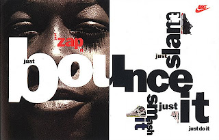
My favorite piece of work produced by Neville Brody. The font is very bold and has great impact, the fact he has used different horizontal alignments of the text and scale creates the feeling of the text bouncing. Below is a link to some of his work.

Powerful & Masculine


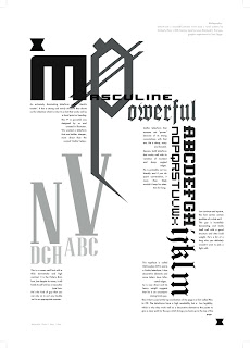
First assignment in UWIC, the group included myself, Aleshja and Kashia. Proudly I can say we where the first group to complete the assignment and meet the deadline of the task. We went down the stereotypical male route with male's generally liking things simple, direct and organized. We wanted to show the dominance of these letterforms which we believed meet our criteria in being Powerful and Masculine. In the criteria it also required us to chose and describe 8 different letterforms as well as using modernist layout principles plus working with a black and white colour scale.

Fatty Fatty Bum Bum


Great chinese artwork, with a vector look style! Very nice overall presentation and very simple to interactive with, have enjoyment popping the bubbles whilst you wait for the content to load up. Another boredom  buster...

Mauricio Guimaraes - Illustrator/Web Designer


Not only a illustrator and web designer, but also a graphic designer. Website is flash based, and unique in a sense it represents his favorite style of work. Well worth a visit.
http://www.mauriciostudio.com/

Mynthon Kaira Ice Fishing

Simple game with overall nice presentation. Nice little something to do in your spare time. Link available below so enjoy...

Sunday 25 October 2009

Brendan Stuart Burns - As Well As Being 2002
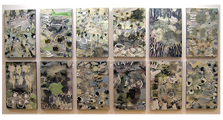

'As Well As Being' was painted Brendan Stuart Burns in 2002. Brendan attended Faculty of Art and Design in Cardiff where he gained a ‘First Class BA Honours Degree’ in Fine Art between 1981 and 85. In 1987 he gained a Postgraduate Painting from the Slade School of Art in University College London.

His favorite materials to use in his work are oil, wax, graphite on board and using perspex to help create these layers. Using the Perspex allowed him to paint not only above painting but the underside, so the painting has three layers in which allows him to create his abstracts. The French Composer Claude Debussy inspires this piece of work.

Claude is one of the great impressionist composer’s. Impressionist composers would focus on suggestion and atmosphere rather than strong emotion. They did this by using the piano using dramatic use of major and minor scales. La Cathedrale Engloutie that Brendan Stuart Burns created this piece of art to, the music is based on myth of the Cathedral of Y’s.

This says on a calm clear morning it is said that a creature would rise from the sea, with bells chiming, monks singing and sunlight streaming through the window, however Claude Debussy created his own musical interpretation.

Across the room Carl Richards own abstract painting gives his own interpretation actually based on the myth, whilst Brendan listens to the music. He says “Painting is thinking; it is a presentation of what you do not know as well as what you do know. ‘Touch’ within these paintings is crucial.

Each of the tiles he has created have been created whilst listening to the same prelude over and over again until the image was complete, in other words he listened to the same bit of the song over and over again until he was happy with it. La Cathedrale Engloutie music he listened to is quite calm and relaxing really, but the impression I get from the music and the painting as an item together is the typical Welsh weather. The colours he has used are quite natural colours in a sense they are the colours you would find on rocks that had been eroded by the rain. How the rain generally starts of slow, picks up a bit more and slowly fades out.

David Alston review on the Brendan Stuart Burns painting suggests that Brendan is influenced by the welsh landscape and has many pictures and sketches of the coastal foreshores and Headlands.

Brendan’s paintings are generally created using the same mediums although scale can range from something as large as this to hand to elbow sized canvases.

His work has made him one of Wales’ most renowned and prolific painters.

I chose this painting as someone once told some thing along the lines "to me painting is not painting if your recreating something photographic, but something that gives someone's own imagination on the subject, now that’s painting".

www.brendanstuartburns.co.uk/home.htm

Friday 23 October 2009

Psychedelic Phenomenon
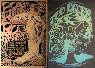

“The Art Nouveau revival dates from 1952, when London's Victoria and Albert Museum organized a great retrospective exhibit. In Germany, where the sway of the Jugendstil (as art nouveau was called there and in Austria) had been total and the counterblow of the 1920s most radical, rediscovery began in 1958 with a big show at Munich's Haus der Kunst. In the U.S. the comprehensive 1960 "Art Nouveau" exhibit at New York's Museum of Modern Art launched the rediscovery”.
And…
“Partly, the European "revival is a sign of tiredness and nostalgia for calmer times," says Milan Architect Gio Ponti. Hugh G. Wakefield of the Victoria and Albert Museum attributes the renewal to the cyclical rhythm in art taste: "Art nouveau is easily recognizable; yet it is now sufficiently far away from us so it has lost the connotation of old-fashioned." But others think the revival of interest in craftsmanship, the elegant and refined, is no Proustian search to relive things past. Rather, it constitutes a revolt against the grim, stark, formless, spiritless expression of much abstract art and modern architecture”.
Full article found on;

So it was seen as a rebellion against traditional values. Many people where inspired by the music at the time, music from legends such as; The Beatles, Jimi Hendrix, Led Zepplin, Pink Floyd etc. These bands used this ‘Psychedelic’ phenomenon to help sell albums and concerts.
The ‘Hippie’ era had began; long flowing hair, bright tie and dye t-shirts, experimentation with drugs, sex and religion. They also found using a gorgeous woman to help promote events, sold ‘sex sells’.

From the images at the top of the page, the left is a poster for Bob Weir & Rob Wasserman from 1999 by Frank Kozik. On the right is a ‘Ted Baker’ top I own brought recently this year. This shows the ‘Art Nouveau’ can still be found today in prints and fashion.

Images where generally found to be;

• brightly coloured although desaturated.

• Had floral patterns inspired by nature.

• Hindu gods were present on many.

• Ornate lettering.

• Symmetrical Positioning.

• Brightly coloured smoke, to give the impression of being stoned.

DesignWeek Review


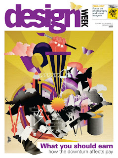
DesignWeek was launched in 1986 in the United Kingdom; from 2007 Centaur Media PLC has published it and it is still the world’s only weekly design magazine that is released 
every Friday.
From 1989 Lynda Relph-Kinght has been the Editor of DesignWeek, her previous experience was working 
for The Architect (a now-defunct monthly) and Building Design an architectural weekly.
The website is generally updated everyday, with all the latest issues and articles available to read online. Using networking site Twitter you are able to follow all the latest news and reviews.
A weekly cost of this magazine would be £2.80 subscription but through the website you can require this magazine; £85 for one year, £162 two years and finally £223 for three years, so you could save up to 53% which would allow you to receive an exclusive package with benefits.
Audience of this magazine generally tends to be people within the design industry such as; Furniture, Graphic, Interior and Product Designers, although it would be quite relevant to students who are learning the trade through colleges or universities.
Design Week sets an innovative tone to how we browse useful links within our broad range of creative design. Utilizing a basic viewing approach keeping the viewer in mind to how we process information and linking that to an appropriate layout built around pure white colours, sustaining interest to its target audience, the creative community, making navigation into your chosen design area simple and effective which no hassle of unwanted distractions.
Design Week hosts a broad range of useful articles that both relate to struggle, techniques and reason used at a professional level giving you insight into contemporary design, the professionals work we see on a daily basis, that can aid young aspiring designers today with examples from top artists, ranging from recent awards, to early stages of design and planning from the developers themselves. With the mass of information, Design Week still continues to capture audiences and deliver the necessary knowledge, which is only relevant to the subject, keeping it easy to read, and continuing interest, which is effective design in its own rights.
One of Design Weeks most recent article is on England's new branding for the Commonwealth Games. Demonstrating the project aim towards a logo that represents the English team at the games in Delhi, which will be printed on the teams kits and communications, showing England's identity through a visual form, which carefully highlights the struggle to design a new brand, keeping the previous symbol and its competitive sprit alive.

Thursday 17 September 2009

Use Full Links...

Freebies - www.dafont.com (fonts),  www.freevectors.net (vector graphics) and www.turbosquid.com (3D models and textures).

Web Design - www.designcharts.com (updated weekly; top 40 flash websites).

Overall interesting sites - www.worth1000.com (image manipulation) and www.bloodsweatvectors.com (vector websites).

Tutorials - www.good-tutorials.com (all software tips) and www.vector.tutsplus.com (vector tips).

Friends - www.huwdavid.net and www.gsanders.co.uk (and also two former students at UWIC).

17/09/09 First Week in Uni

Signed up to blogger.com to enable me to track my progress throughout my time studying Graphic Communications at UWIC.

Mapping Project went ok? Some good strong final visual from some groups in the class. I would have however preferred to be chucked in the deep end and have a short assignment set out  at the start to show what I can produce.

However tomorrow should enable me to do this, with the presentations of our Summer Project